For: Nana Tomova
Skills: Logo Design, Creative Direction and Illustration

Logo Exploration
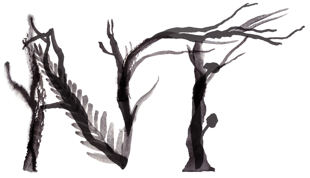
Final Logo Design
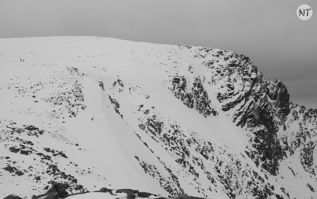
Amongst her many talents, Nana takes incredible photographs of beautiful, wild landscapes and she wanted her logo to be evocative of nature and wildlife. After we had discussed her logo requirements and explored her reference imagery, I began the project by making a series of illustrative experiments. Using ink, watercolour, pen and pencil I tried a wide variety of approaches to mark making and crafting letters, working in black and white initially to better focus on form. I created mockups of these in situ on her website so that we could quickly get a sense of which approaches were in-keeping with her different photography services.
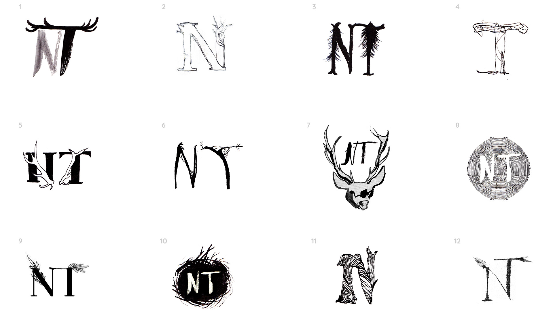
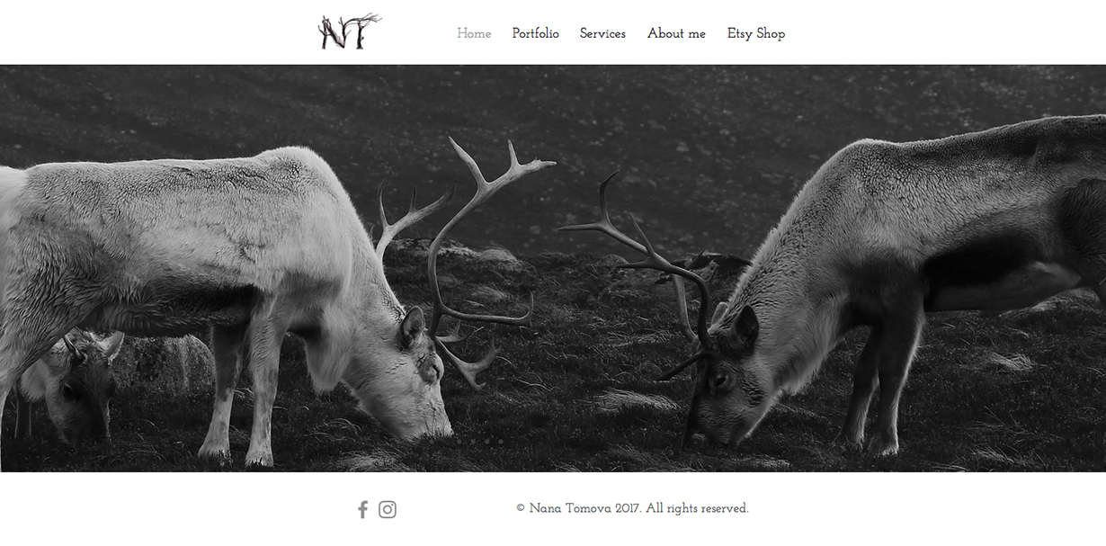
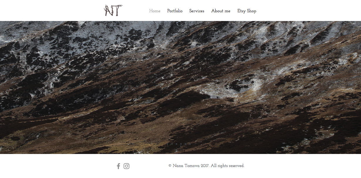
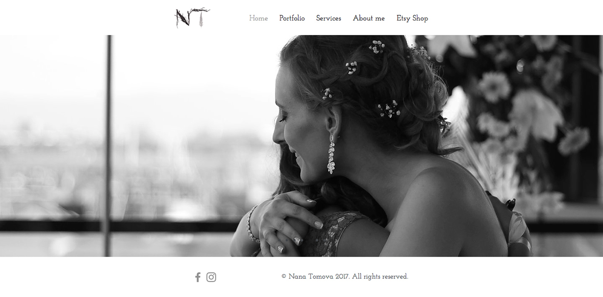

Nana wanted an illustrative and uniquely detailed logo, but it was also important for her that it be clearly distinctive as her ‘NT’ initials and could be easily recognised at smaller sizes as a photo watermark. We explored using animals in the design, but ultimately settled on more abstracted forms and softer flourishes of detail around bolder letter shapes. For the next phase of design, we selected three possible routes from the initial experiments for me to develop further.

Sketchbook Experiments

Route 2, Design Exploration
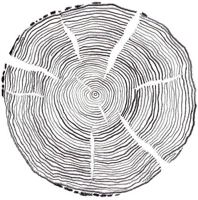
The design really came together in the third phase of the project. I settled on using ink to draw a variety of flora and fauna that would eventually be pieced together to form the ‘NT’ letters. I used different tools to draw these, including twigs, and wet the paper to varying degrees. This created interesting levels of opacity and textures when the pieces were overlapped. I brought them into Illustrator and converted them to vectors to ensure that the logo would not lose its quality when scaled up or down. Though Nana decided she preferred the monochrome version of her logo, we did carry out some subtle colour tests, using natural, neutral colours to reflect the seasons.

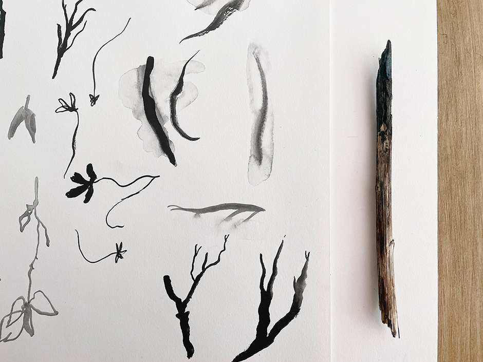
Twig used for mark making
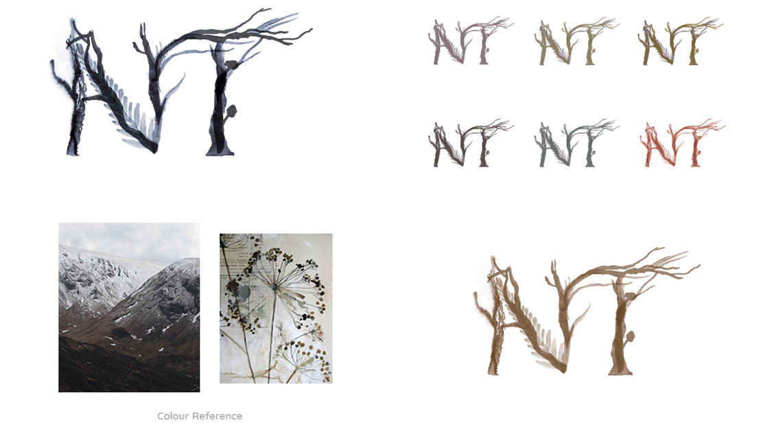
With the final logo created and signed off, I prepared an asset pack for Nana. This included the logo in a variety of ready to use sizes and formats, the logo source files and some simple documentation for best use. Nana was very happy with the results! Though she has since refocused her website on her Storytelling work, she still uses her NT logo on the new site. As a nature lover myself, I really enjoyed working with Nana to bring her ideas to life for such a creative brief.
